Week 10
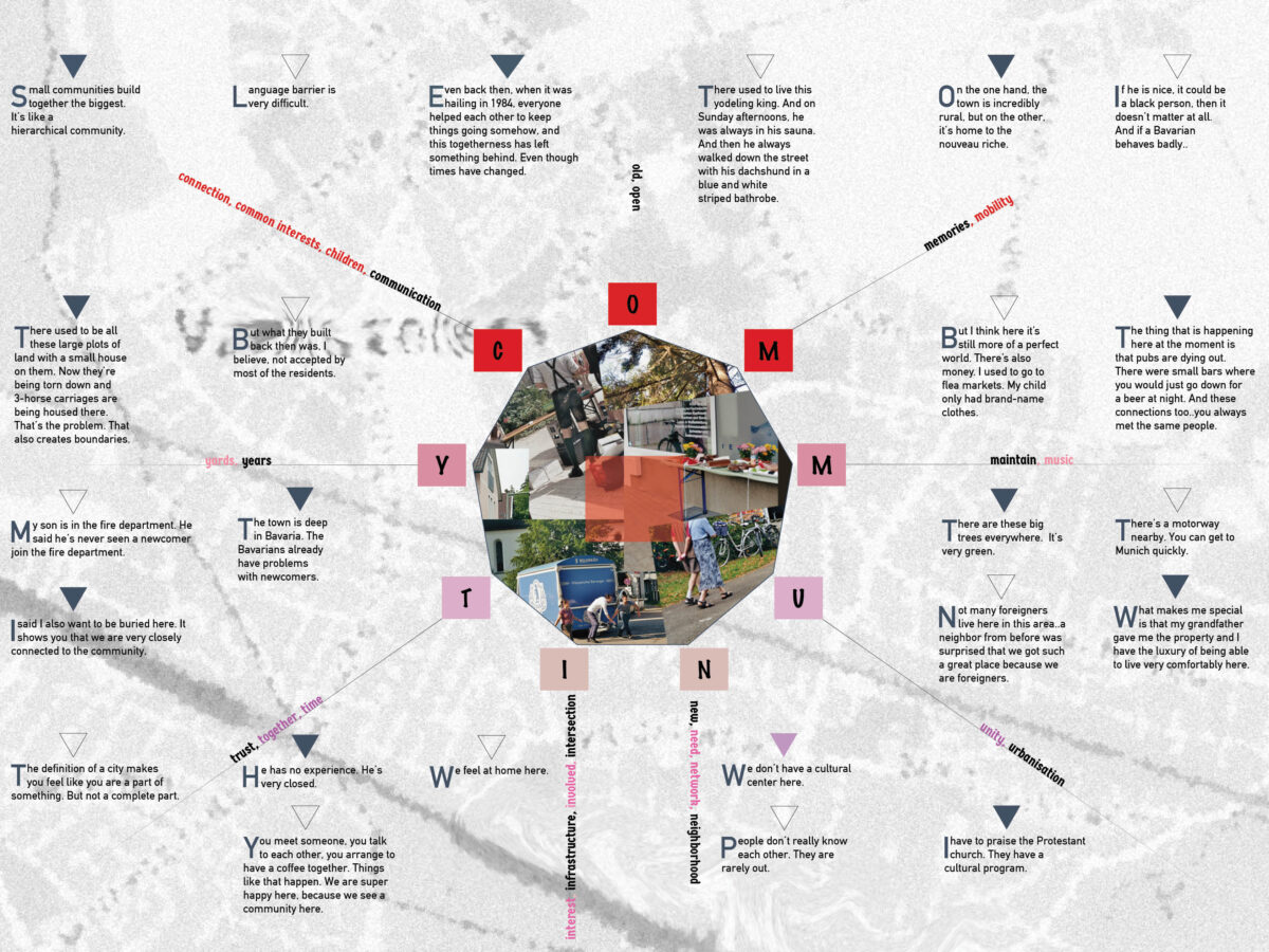
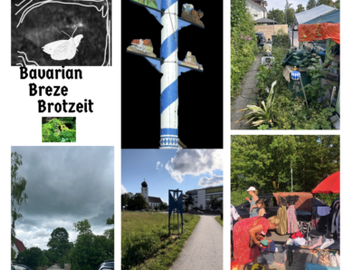
This week, the topic of typography came at just the right time for brief 3, as since my last tutorial with Paul, I had been pursuing the idea of creating a typographic statement in response to the interviews I had conducted in my neighborhood on the topic of community.
Lecture about typography (Kristoffer Soelling)
Kristoffer Soelling from Regular Practice spoke about historical type printing processes as well as type and design.
From the invention of movable type blocks (Gutenberg) to the Linotype machine in the 19th century, which accelerated the printing process, to the unlimited possibilities we have today when designing typefaces.
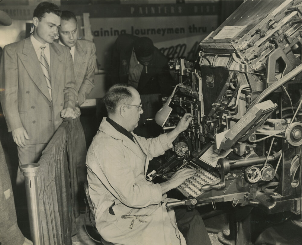
Linotype machine in use1There is a relationship between the technique and the aesthetics of design. A letter that is individually carved in a specific size, as opposed to a letter that can be reproduced in different sizes using a disk. Or printed fonts that are softer in shape (trim) and unprinted fonts that are harder.
For Soelling there is no one right way to use and work with typography, yet he finds it helpful to be able to recognize and distinguish letterforms, the (historical) relationships to this typeface and possible meanings it can have in certain situations.
For the Bauhaus movement, type could be seen as a system without focusing on the meaning of type. Herbert Bayer tried to create an universal typeface without distinguishing between upper and lower case letters. In Dadaism, a liberating type movement, the meaning of type was also unimportant and type could reproduce sounds.
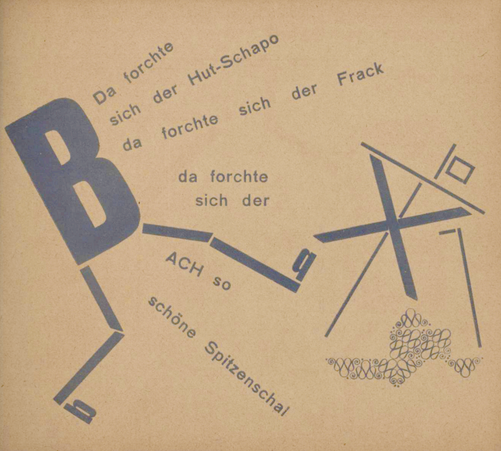
Die Vogelscheuche. Märchen, 1925
(The Scarecrow. Fairytale Die Scheuche. Kurt Schwitters)
Designers such as Vim Carl and Wolfgang Leingardt did not neglect the importance of type systems, but looked for new possibilities such as playing with different sizes in their designs.
Nowadays, everything seems to be possible when it comes to type. Technological advances in graphic design are linked to certain points in history. Designers need to push new ideas and are not just providers of a beautiful interface or service.
Webinar with guest lecturer Henrik Kubel and other research materials
In this week’s webinar we had a very informative talk from Henrik Kubel, who develops custom fonts. He talked about different projects he has worked on with examples. For him it is difficult, but he also prefers to design small fonts or copy fonts like in newspapers. Nowadays fonts have to be very strong compared to the past.
It’s about crafting letters that are distinct and beautiful.
I like to start a new project from scratch by drawing with my hands. This gives me access to curves and proportions again.
(H. Kubel)
Kubel says It’s about reading the words and not looking at the typeface. That’s often the reality when it comes to fonts displayed on screen. However, for posters, flyers and other printed designs, you can choose something that attracts more attention. Still, different types of work have their own requirements. For him, it is important that the text is readable and attractive to the audience. Scott Williams and Henrik Kubel emphasize that even though typefaces are available for everyone, ready to be designed, deployed and printed, that it’s a skilled practice.2
Tutorial with Paul, Maria and Louis
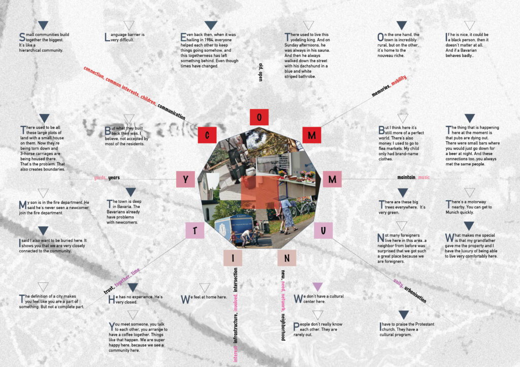
Louis found the design itself quite beautiful. Nevertheless everyone agreed that it’s hard to read the community letters in the center. Also, how to distinguish between the stories told by the people.
It was nice to get an insight into Louis and Maria’s work on their latest briefs. I liked their idea of telling stories with the help of videos. Louis had filmed his neighborhood. I specifically liked how he used different sounds to change the atmosphere of the movie.
I told that I had been thinking about creating a movie for brief 2 (actually before I had created a process model of a growing dandelion in Illustrator), and Paul mentioned that I could use top-frame animation (frame-by-frame animation). I would definitely like to learn more about this and other animation and movie techniques for my designs. But unfortunately I won’t be able to learn more this time as the course is coming to an end soon.
Research task: Think about the creative community in your region
- Draw up a list of individual creatives that work in or close to your local area (these people may be based in your immediate vicinity or could be located in a city nearby).
- Briefly outline what these creatives do and why you like their work. If possible, make note of their contact details, website and social media.
In Munich:
Herr & Frau Rio: Risography printing orders, workshops and own products
What I like:
- environmentally friendly printing process, workshops to learn Risography print
Herr & Frau Rio Instagram
Webdesign München | Designhoch10: Web design
What I like:
- barrier-free web design for customers with visual impairments etc.
- professionalism with a personal touch; when entering the website one can see videos of satisfied customers (a “proof” of their good work)
- the studio’s brand: one-person design under the direction of a likeable power woman that had eye problems herself in the past and made the best of her situation
Designhoch10 Instagram
Future Playground (I had contacted them already in week 3 for a small interview): Interdisciplinary design studio
What I like:
- small 2-person studio with a design that seems to focus mainly on print design and stands out for its beautiful appearance
Future Playground Instagram
In my town:
Gecco-Design: Development of corporate design, advertisements, print design, conception and design of websites
What I like:
- it’s a one-person company that certainly seems to have a connection to local needs
- I like some of the designs for the local fish restaurant and catering
Gecco-Design facebook
- https://www.printmuseum.org/1895-linotype ↩︎
- New perspectives in typography (Scott Williams, Henrik Kubel) ↩︎
No Comment