
Week 11
Research materials
Symbolism & Semiotics
In his lecture on symbolism and semiotics, Martin Hosken says that it is the message received that is important in communication, not the message sent. Semiotics is the study of signs and symbols and their use and interpretation. A sign consists of the signifier, which gives the meaning, and the signified, which is evoked in the consciousness. Both interact with each other.
A further distinction is that between an icon, a sign that resembles something (e.g. a photograph or a Onomatopoeic word like ‘boom’); an index, which is the evidence of what is represented or implied (e.g. smoke is an index of fire); a symbol, which has no similarity between signifier and signified (e.g. flags, the red cross). A symbol has an implicit rather than a specific meaning, whereas a sign is a definite signifier.
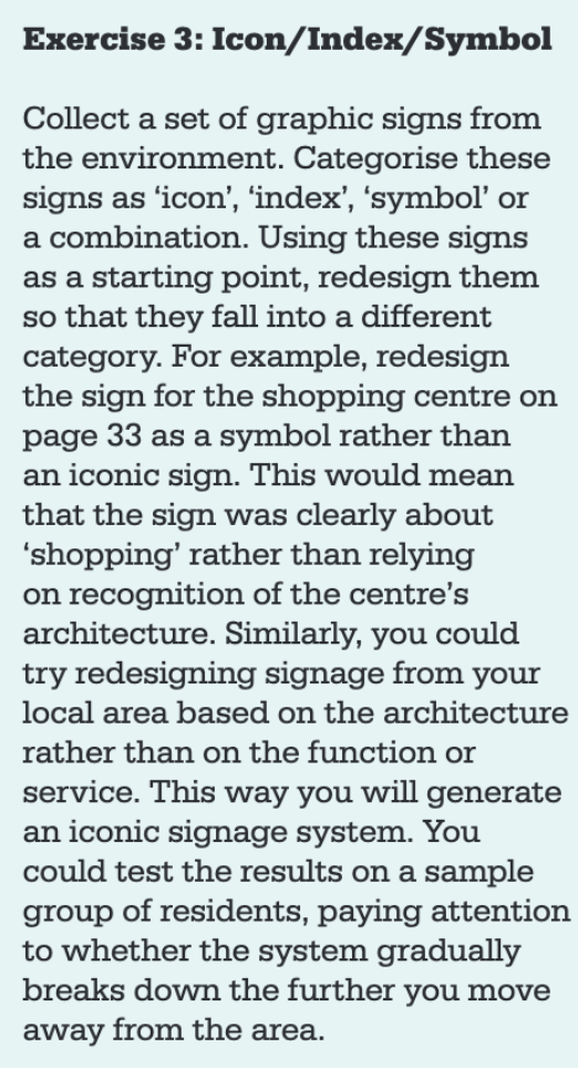
Screenshot out of Visible Signs: An Introduction to Semiotics in the Visual Arts
by David Crow1Some thoughts
The exercise above shows how many possibilities we have as designers to create something. Symbolically redesigning a sign for a shopping centre sounds challenging at first, because how are people supposed to understand the sign if it no longer shows a shopping centre, but a shopping trolley, for example? People are used to certain signs and the context in which a sign is shown. They probably first have to learn to associate the shopping trolley with the shopping centre. Or when it comes to the Apple logo. People first had to learn to connect it to the product. Now everyone knows it as a global brand. But how about small brands that are not as successful. How can we create memorable branding for them?
The problem is that language can have different meanings. The meaning is expressed in the sender’s intention, and communication can take place through a shared understanding of the meaning. Images are associated with intentions, but can have different meanings depending on the context, which can change culturally.
Tom from Regular Practice (case study)
Tom talks about methods used to show a recurring event – the Olympic Games – from the perspective of the country in which the event takes place. He categorises the methods into systematic (e.g. Olympic Games in Mexico – Lance Wyman 1968), emblematic/figurative (e.g. Olympic Games in Tokyo – 1964) and abstract (e.g. Olympic Games in London – 2012).
The variables remain the same (the event itself), but the global context changes (the location/country). This is a big challenge for the designers as there are a large number of variables that they can borrow.
Patrick Thomas: Breaking News 2.0. Installation (London Design festival)
Patrick Thomas’ installation displays global headlines via internet RSS feeds and randomly selected graphic shapes. Visitors can also interact and add their own headlines to the mix using an iPhone.
The installation raises the question of authenticity: Where does our news come from, can we trust it? At the same time, visitors are offered a stage for their own form of communication.
Other research materials2
A story of communicating social matters
James Victore has created several posters that deal with social issues. He talks about his experiences of getting his work out on the streets (without it being torn down) and how difficult it was to find a sponsor as not everyone understands the impact a poster can have. He tries to avoid clichés in his work, but depending on the audience it can be more effective to use them. He tries to communicate in simple forms, whether to address the emotional or intellectual aspects of the recipient.
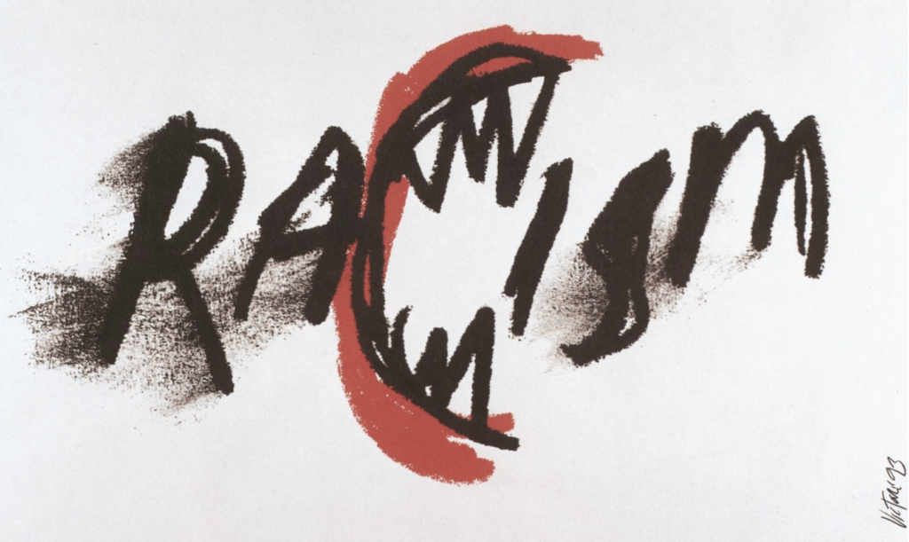
Racism Poster
Victore Design Works, 1993
Censorship
When it comes to censorship, the main reason companies stick to it is because, as Heller says, they “fear an angry readership” and not because of the law. Freedom of speech is not guaranteed in every respect.
What is expressed might be acceptable in one cultural context but unacceptable in another.
The value of the visual essay
Many editors and art directors feel that painting and drawing is not objective enough in a media world that is all about disseminating information. In the past illustrators have mainly illustrated single images without the ability to contribute to larger editorials. The ability to create visual essays gives Illustrators back a certain freedom and artistic voice.
Sue Coe believes that illustration offers the opportunity to connect with audiences on a different level and slow them down in a fast-paced world.
Research task: Explore how brands are communicated differently depending on their regional context
- Choose a brand that exists within a range of different global regions. Explore the varying design approaches of this brand and the ways in which it chooses to communicate in different countries. What differences and similarities can you spot? Why do you think the brand might take certain design decisions depending on regional context?
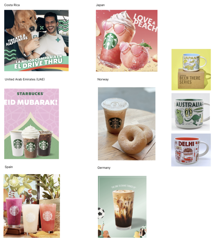
Starbucks has shops in many countries. When I look at their Instagram or websites in different countries, I can see that the product itself hardly changes. It is always the logo with the siren and the green background that makes Starbucks recognisable in every country. What changes is the context in which the product is shown. It is either something that has to do with the country. In the United Arab Emirates, for example, an ornate background is used. Or it has something to do with a specific event that took place in that country (on a global level). In Germany, a football-themed background was used for the World Cup. In some cases you can see a certain pattern, like in Spain and Costa Rica, where fresh and dynamic colours are used, while in Norway or the United Arab Emirates the colour scheme is a bit more subdued.
I think Starbucks wants to maintain certain features that make the company recognisable, such as the logo or the products on offer. But in other ways, they want to connect with the local population by incorporating certain cultural features or showing people from their shops so that people can connect with the brand.



No Comment