Week 4
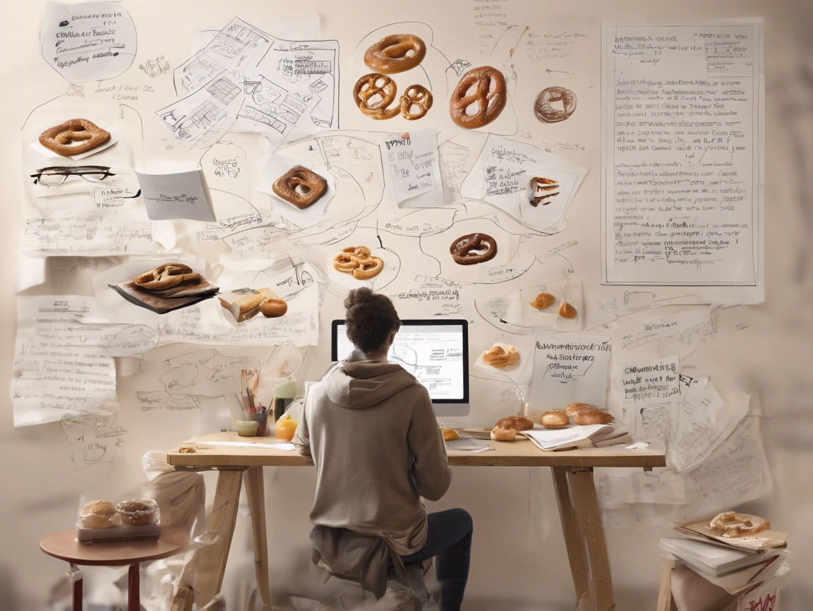
My image above for this week was created using Elementor AI. I created it after I had written most of the blog content. I think it’s pretty funny, especially the combination of research and a bunch of different pretzels and other pastries. Obviously the person’s hair seems a bit out of place 😉
From last weeks resource material:

(Katherine McCoy: Layers of meaning)
I think it’s the motivation that drives me every day to push myself to my limits and manage my studies and work at the same time (not that I’m any different from anyone else – we’re all in the same boat). The last few weeks have been pretty exhausting though. The self-initiated project is taking up all my free time. Fortunately, I have the advice and feedback of students and tutors. I like to see how my task is developing…. I just have to keep going.
Tutorial with Teresa
In last week’s design crit I talked about my idea for brief 1. We talked about the speculative nature of this short project. And Teresa mentioned that we should develop some personas/case studies/user flows. It’s important to get a feel for the needs and emotions of the (potential) users. And the message that should be conveyed through the design. In today’s tutorial she told me that she liked the shape of the heart pretzel and that it appears as a red line in my design. On the other hand, she advised me to continue with the design. I should look at the design of other craft businesses.
Other Notes from the tutorial:
- Check typos (mix of upper and lowercase in the ready-made mix bags);
- Consistency: Remove white space between Pretzel with <3 -> Pretzel with…<3
- Popup: What is making the product stand out for the customer when they enter the bakery (can be a poster, can be how the products are displayed etc..)
- Who is my target group?
- Maybe milk can be left out as a product that has to be in the bag as it is easy to get?
- Is the product for multiple bakeries or only one?
Webinar
In this week’s webinar, Teresa talked about a client brief she received a few years ago to redesign and repackage 22 books by author Muriel Spark. It was really impressive to see her process in such a short period of time. And how ideas, core values and attention to detail in collaboration with others, such as the printer, led to the result. When it comes to design, she favours a typographic language over illustrating graphic content, which is very interesting to me as typography is something I really need and want to explore further. She always works with some core values that she establishes at the beginning of the project (in this case about the author). With the values and her research question in mind, she chose the font Gill Sans Ultra Bold. She said, ‘Fonts are like friends’. One of the students asked her how she decides on a particular font: it’s the experience.
Teresa has 6 main fonts (6 sans and 6 serif) in her toolbox. As with so many things, getting a feel for typefaces comes down to motivation, curiosity and practice.
Research
The webinar motivated me to re-examine my own font combination and think about the meaning of the typeface. So I changed my logo a little to communicate more clearly what my logo is about. I also worked on creating personas and a user flow with my target group in mind.
I also did a bit of research about working in a bakery. And I found a YouTube video where a woman is working in the field and the TV crew follows her for a whole day as she goes about her daily work. She even talks about her salary, and you could see in the comments how people were discussing how that’s not enough, even though she seems to be doing well. But she’s the manager of the branch and has been working there for many years. Others commented that it’s more than the average you normally earn in this field. This got me thinking again that it’s quite unfair that you earn so little in a job with a lot of responsibility and at a high level and much more in other areas, e.g. as a manager in a large company.
Podcast with designers:
We re-engaged with C. Miller and the other designers. One question was how self-initiated projects have helped them to shape their studio identity.
C. Miller says that self-initiated projects help him to find out what he is interested in, they act like a filter and a business card at the same time. This is similar to what Teresa said. They can always be a part of the portfolio you want to show or an area you want to work in in the future.
V. Fuerte mentions that they help to break the boundaries of creativity and identify yourself or the studio. V. Frost, on the other hand, says that client projects and helping other people solve their problems have shaped his (studio) identity.
Client work and self-initiated projects are mutually dependent (J. Stringer).
For S. Bompas, self-motivation is important when it comes to self-initiated projects, but in general he likes to treat client-led and self-initiated projects equally. When it comes to processes and evaluation (1. creative? 2. financially good? 3. potentially famous?)
In J. Stringer’s opinion, the bigger the client, the more the level of creativity needs to be curbed in order to do justice to the brand image and not alienate the consumer.
The Wayback:
There was a lot of materials this week regarding “The Wayback“, a VR film series, that recreates positive moments from the past for people with dementia. It shows several scenes of people’s life on the day of the Coronation of Queen Elizabeth (1953). The hope is that from triggering those happy moments meaningful conversations with loved ones or caretakers can place.
The initiators first had to go through a funding process. They wanted to make the film accessible to everyone so that it could be downloaded for free in the app or on YouTube. They also wanted to make the experience as enjoyable as possible and therefore originally chose Google Cardboards as the medium for people to watch the film. Most of the people involved in the film were volunteers and had a connection to dementia.1
This project shows how important the meaningfulness of a project is and how other people are willing to contribute even without payment if they can identify with the project.
The film itself has an interesting way of telling a story. In the first scene, you see a woman putting up decorations on the street while others walk by, and you hear people talking in the background (but they are not shown). This gives you the feeling of being in the middle of the action.
Then the film starts to focus on the characters, such as a boy watching his father on TV or a woman singing and making sandwiches. In this one scene she is the main character, but later she is shown again, more as a supporting character, but the viewer can identify with her (having seen her before). There is a common thread that runs through the whole series.
At the end of the film, the credits and pictures of some of the ‘real’ people who had dementia are shown. I think it’s a very emotional and personal film, but in the context of a whole generation of people who were there on the day of the coronation.


No Comment