Week 3
Research task week 2 continuation
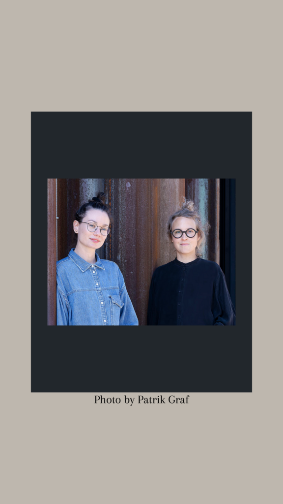
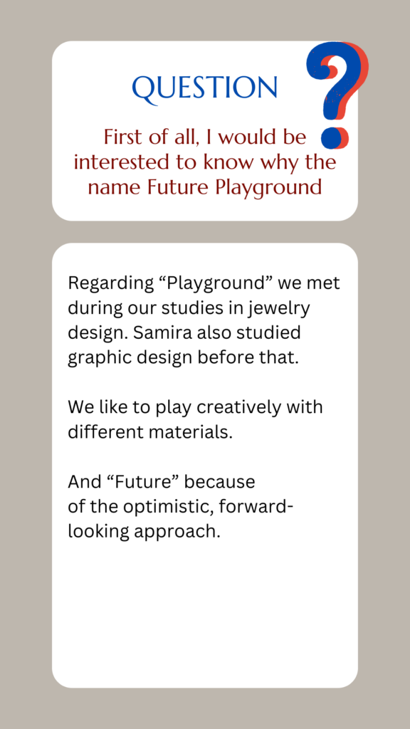
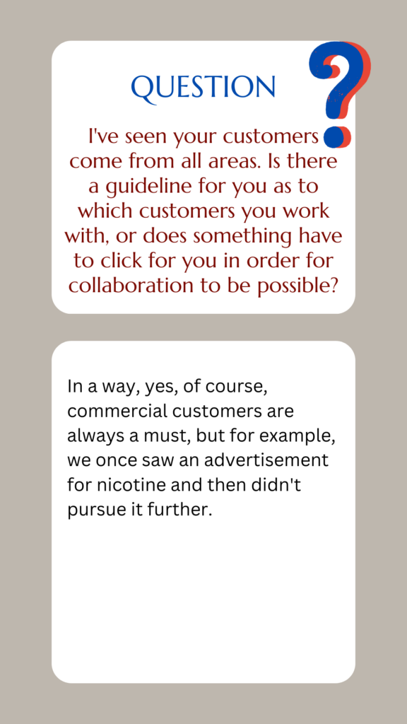
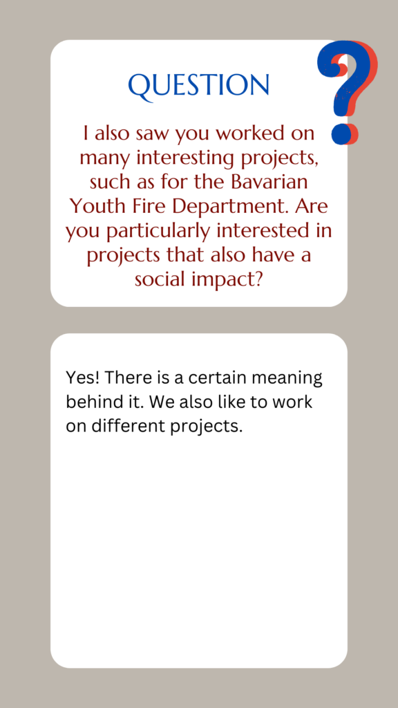
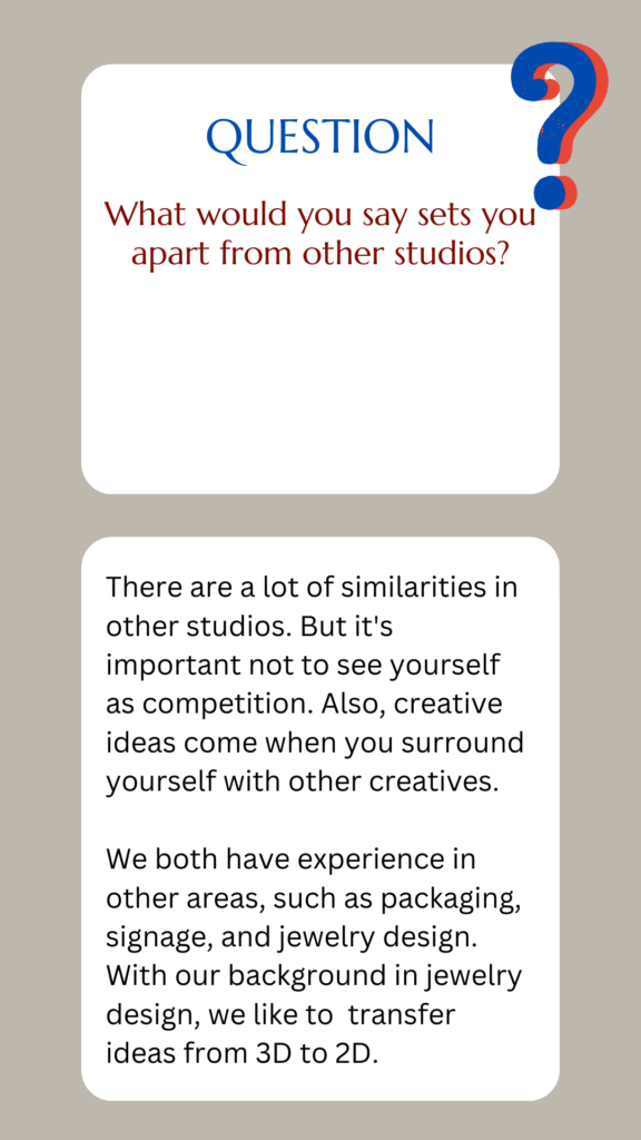
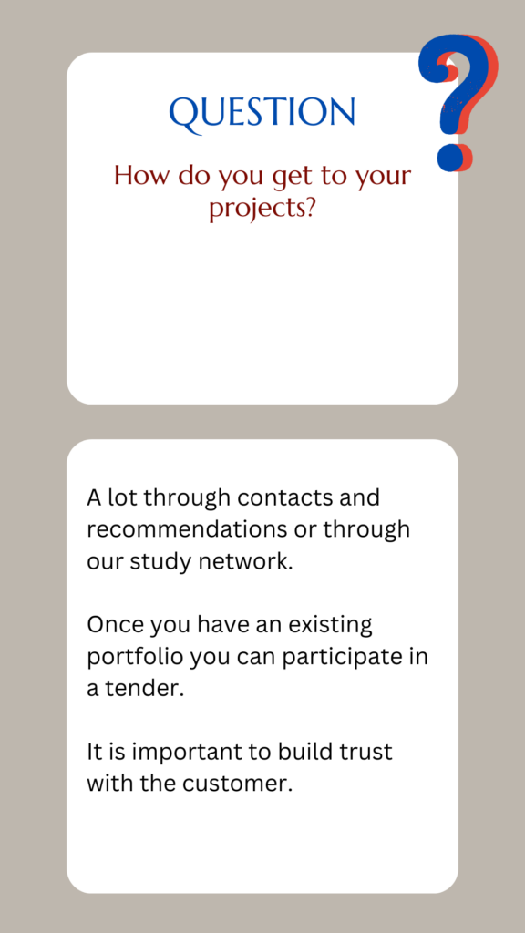
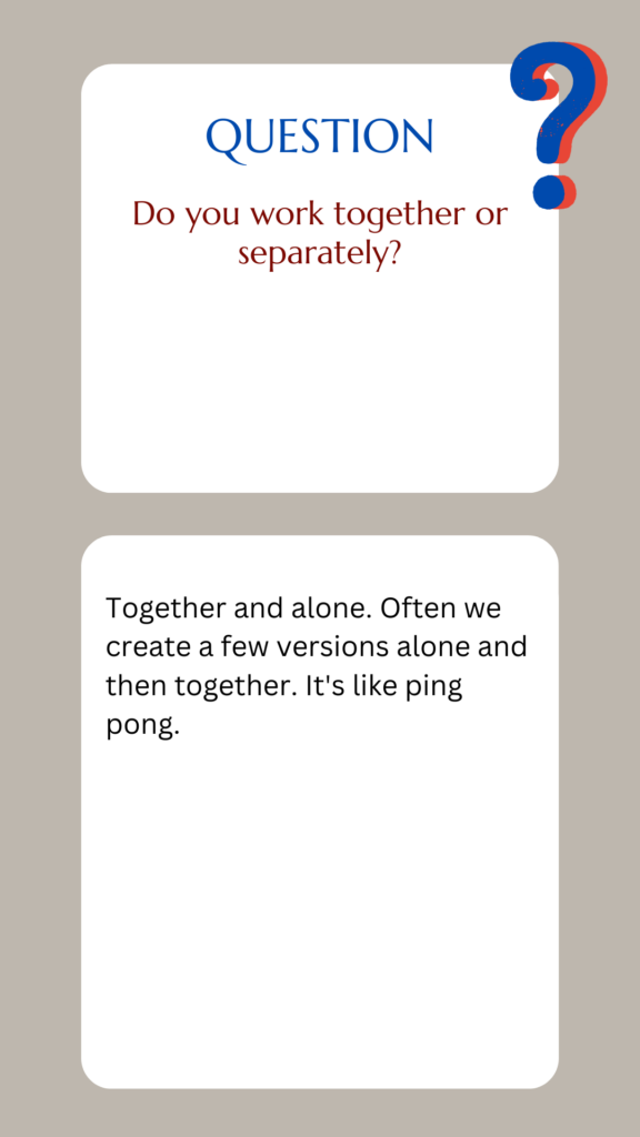
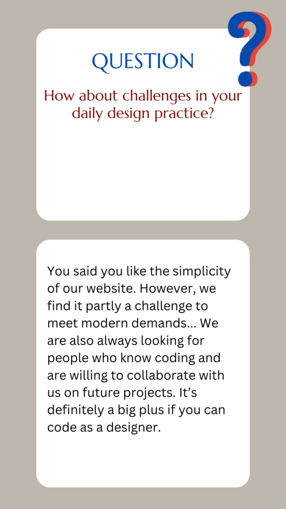
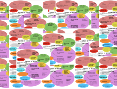
Last week I decided to contact Future Playground, a Design studio in Munich as part of my research to explore local design outlets. Thankfully they accepted the interview request. I wasn’t able to visit them in their studio because of my location and full-time work during the day. Samira and Janina, the two designers behind the studio agreed to a video meeting and recording it (using the transcript afterwards). Unfortunately, the recording was not possible. Nevertheless, I got some interesting insights into their studio practice.
Interview (translated from German):
Research – Effect of Globalisation
This week we looked again at the designers from the first week and how they have been affected by Globalisation over time. They mostly find the impact positive, because of the interconnectivity and possibility to collaborate with people from different countries and cultures.
Sarah Boris talks about a “global to local” business opportunity that came up because she talked at a local Design Festival to people. Julian House, Adrian Talbot (Intro Design), Tom Finn, and Kristoffer Soelling (Regular Practice) find it positive that you can work from anywhere. On the other hand, Sam Winston says it “added a lot of speed to life”. Nevertheless, he and Julian and Adrian argue that the most important thing is still the human connection and being a people person.
Harriet Ferguson this week’s guest lecturer, works on projects around the world. The company she works for, Pearlfisher, has studios in various locations, which helps to attract customers from all over the world. The designers are not bound to their location but collaborate. Harriet believes technology is what links them together. She mentions a project for a company called Femme producing tampons in China, even though there it’s more of a taboo. But they came to Pearlfisher because the Chinese favored Western aesthetics. In some of the projects she worked on so far, the designers were able to immerse themselves in another culture to understand their target group better.
Nevertheless, she warns against online sources that show design patterns, such as Pinterest, as this could lead to a “homogenised design”. She argues that it is important for a brand to be authentic and for customers to be able to interact with it, especially as they become increasingly design-conscious and skeptical of brands. Well-known brands like Apple became their own cultural reference, and instead of mimicking, they have a unique way of telling a story. She mentions Oatly with its authentic sustainability message and simplistic design. For Ferguson brands need to create a design, that is dynamic, animated, and implies change. It’s about thinking global but acting local.
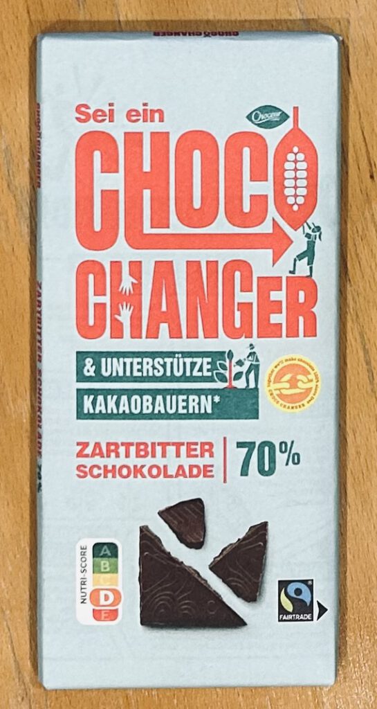
I found this chocolate in a supermarket. For me, it shows some of the aspects that Ferguson mentions above. It is fair trade (sustainability), implies change (“choco changer”) and its supporting local cacao farmers.
Research – Film by Non Format
Jon Forss and Jell Ekhorn from Non Format find it very convenient to work from anywhere and collaborate on the same projects in shifts.
I found it very interesting to see how type has changed in their practice over time. First it was about type on image and finding the right layouts. Next, they experimented with type as image, such as super bold fonts. Then they integrated photography into an illustration over type. Nowadays (I think this is still the case, even though the video is more than 10 years old) it’s more about designing three-dimensional typefaces. It’s important for them to experiment with type in their practice. They also believe it’s important to reflect on previous approaches while looking forward (as with digital design).
Research task: Explore fields of design and boundaries between disciplines
The D&AD Awards host a range of award winners in the field of design, advertisement and craft.
In the category of Book Design, I noticed Apophenia a book by Julie Wolfe. The use of fluorescent pink instead of magenta for the printing and layout of the images and illustrations creates a dreamy feel. Even though the images seem random, in the end, a message is sent to the audience. It shows the power of combining images, typography, and color can create a mesmerizing output.
Another project I like is the Bite Back from the Branding category. The project calls out global food companies in their marketing of junk food. The use of cute illustrations of animals reminded me of the TV series Happy Tree Friends, whose characters also seemed cutely animated at first, but turned out to be violent at times. The biting mouth as their logo is very effective in its symbolism and creates meaning.
In the category of Graphic Design the book DE.CODED – A human atlas of Silicon Valley features 100 individuals who are driving social impact in Silicon Valley. The usage of photography featuring the persons themselves, graphics, and the possibility to learn more in an app about each person creates a connection to the people and the environment. The title implies that when people think of Silicon Valley, they usually think of tech giants like Google or Amazon. It’s good to remember human history and the influence of people in a particular area.
Reflecting on the different categories I could see that the boundaries between those categories are becoming more and more fluid. Even a traditional medium such as graphic design has many references to other areas nowadays. For example. A Million Logos by Colgate is in the graphic design field, but has clear references to retail.
In the retail sector advertisements seem to appear to be aimed at a wider audience. They also make more use of the power of social networks such as Instagram to promote a certain product. An example is the Heinz x Absolut Tomato Vodka pasta sauce project, which went viral because of the influencer community. Or the Hammerbarn, a hardware store from a children’s series that became a reality for a few days, while pushing sales for the company.
One category that seems to be relatively new is the games and virtual worlds category, where reality and the virtual world seem to merge, such as the Fosterverse, where people could virtually support a version of a real foster dog that was then later put up for adoption. The sustainability or social relevance seems to have an impact in all the categories, by doing so they help not only the planet or the people but also their reputation and it might have an impact on a rise in selling their products.
Webinar and other thoughts
This week we had our first Design Crit, in which we had a chance to show our progress with the first brief and see what other people have been doing so far. It was a very understanding, constructive, and appreciative session. It felt like showing it to like-minded people had a supportive feel to it. I learned a lot from other people’s perspectives and how they approach a project like this. Grace for example used Figma to structure her thoughts better and created columns where she put a mindmap for each question and then under it some graphic ideas.
I got the feedback that my idea with the fingerprints creates value with its simplicity. Just as Paul had advised me after my first tutorial, I had tried to go back to a point at which my mind was clear and didn’t try to see things complicated or overthinking but creating a clear message. Louis mentioned I could also think it further by creating an outline like in a crime scene with paint. Now the message has to be improved by adding some typography to it.
Paul advised me to leave the photos mostly as they are and just add to each image a typography counterpart. Daniel suggested doing the typography not in Photoshop as the output is better in InDesign. Also afterwards, I could work further on the project in Illustrator.
Paul also positively noted the De Sign word written as stars, which I had previously sketched out on another piece of paper.
No Comment