Week 2
This week has been full of impressions and new ideas. I haven’t posted anything about my short ideas yet, so let me start with that.
First brief ideas
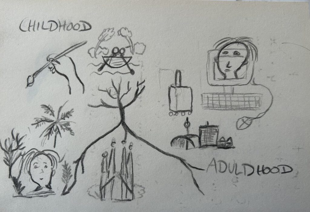
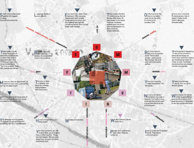
I think I’ve never thought about myself that intensively as in the last two weeks. The quadriptych is a polyptych that consists of four images. What came to my mind first was to create some timeline of my life location-wise, time-wise, and meaning-wise. I just recently moved back to my home country and the area where I was raised.
So I first thought about creating images that show my childhood, the years I was traveling, and finally the “coming back to the roots” as my current state. I had this image of me sitting in different locations.
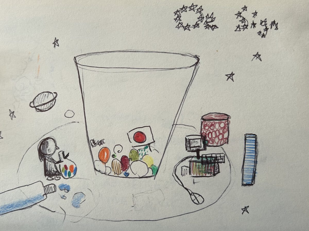
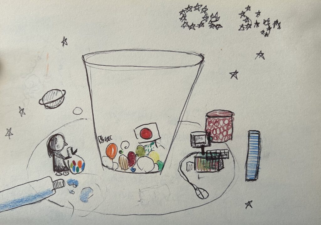
Another sketch from my sketchbook: Me living in my own universe, adding all this memories to a big glass pot, spilling some water sometimes (“the bad times in life”); De Sign as something that was in “my stars” (DE= Germany, Sign = a sign for me to start with Design).
Idea 1
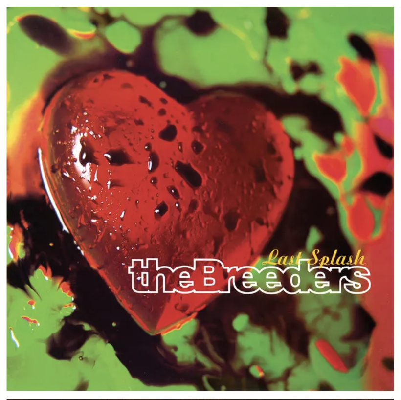
Oliver’s cover designs for the 4AD labelIn this week’s podcast, Vaughn Oliver was mentioned, a Designer I haven’t heard of previously. I like how he plays with images, colors, and textures.
After that, I started thinking about textures and creating some more organic designs (still having the timeline in my mind) featuring my feet and depending on the location with different textures.
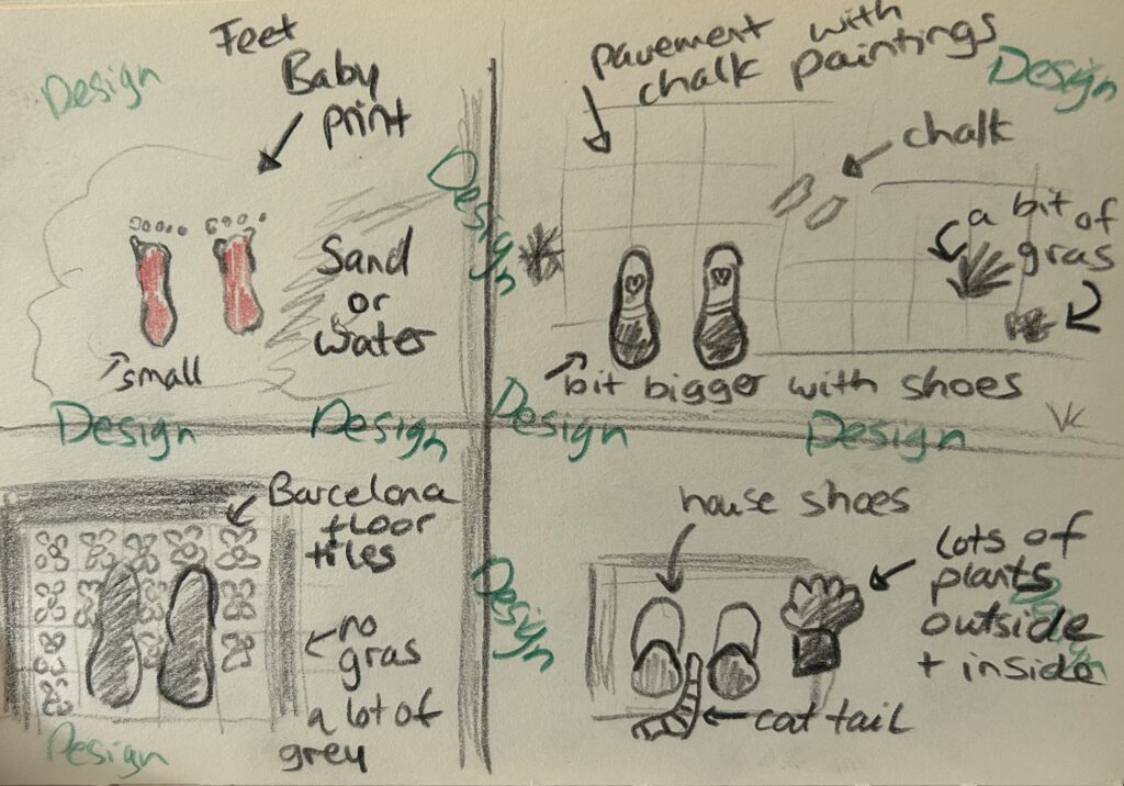
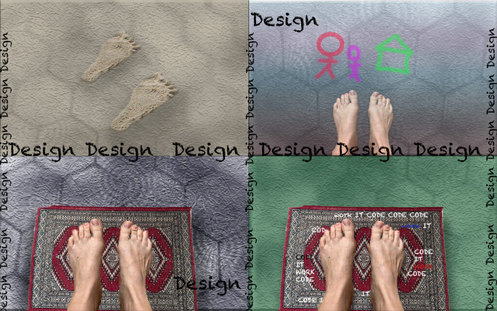
I had this idea of (colorful) prints of feet on the ground (or feet in the sand) that eventually would continue walking on the pavement. In the second panel there is chalk on the floor as a symbol of my childhood, and the next panel is about being in a ‘creative’ city like Barcelona with its beautiful tiles, but no nature around me. And finally being surrounded by nature but at the same time confined to working from home (the carpet here is a symbol of home). All the time Design is everywhere.
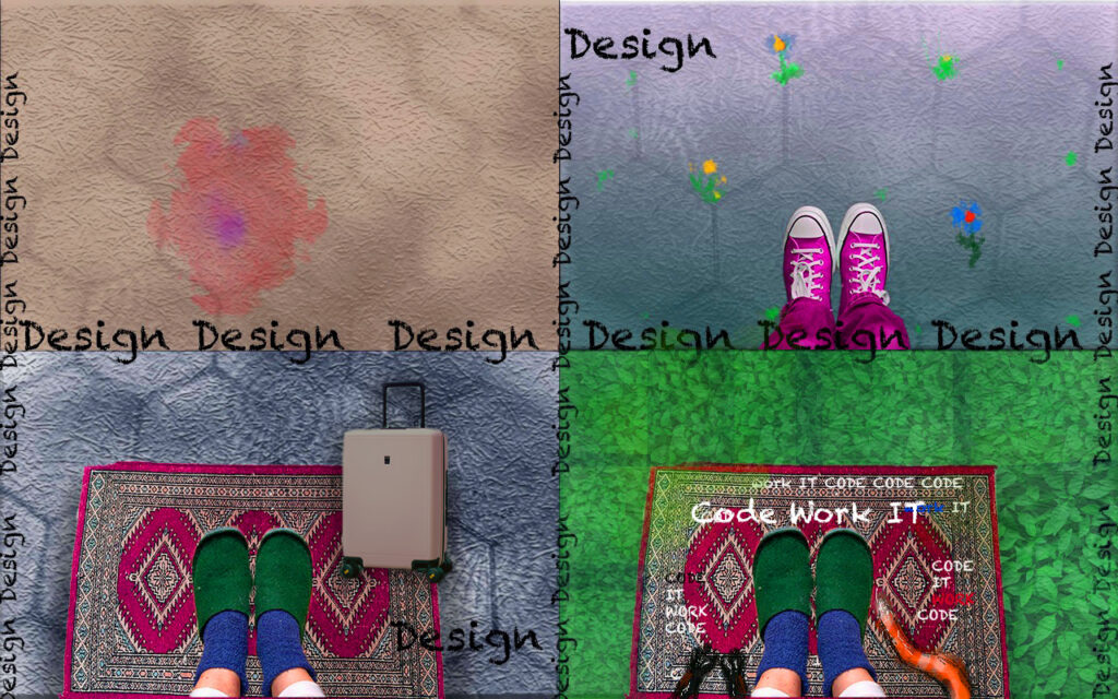
Next, I started developing my idea in Photoshop, with a picture of my bare feet but I didn’t know how to convey the idea of the timeline properly. So I decided to wear shoes instead. They offer a way of self-expression, reflecting our unique identity and personal style. I always wore colourful shoes as a child. Nowadays, I wear slippers when I work from home. I also made the colours more contrasting and energetic and added pieces of luggage that symbolise my travels to different cities. The carpet serves as a stage for my work and the state of the home office.
Feedback to design idea 1
“There is a lot going on at the moment”. That was one of the reactions I got from my first tutorial with Paul. He advised me to go back to the purity of my feet. He mentioned painting with feet (an idea that had also crossed my mind as explained above), wearing different shoes. Or take a walk and film my feet. Another idea would be to think about what my feet do, they dance and stand. Different meanings of feet etc. Also, I was told it’s better not to be fixed too much on the idea of having to communicate something in this brief to my audience. Which I find hard, as Graphic Design is a way of communication; and images and fonts in combination are used in a certain way to convey meaning. However, I believe that this assignment is more about finding out something about ourselves than about the identity of a customer.
I also asked for advice on how to learn and understand more about typography. I researched Jan Tschichold from a historical perspective, as he was one of the main proponents of using modern sans serif type as a simple and clean method of conveying meaning. All graphic design, and therefore the emergence of typography, must be seen in its socio-ecological and historical context. Tschichold had to flee Germany during the Nazi era and decided to return to classical typefaces with decorative elements. One of his most important typeface creations was Sabon, a serif font.
Another designer, Paul Eliman creates his own font from found objects which I find very fascinating. Although his font from found objects might be hard to read and therefore most likely not used as a font in advertising.
Idea 2
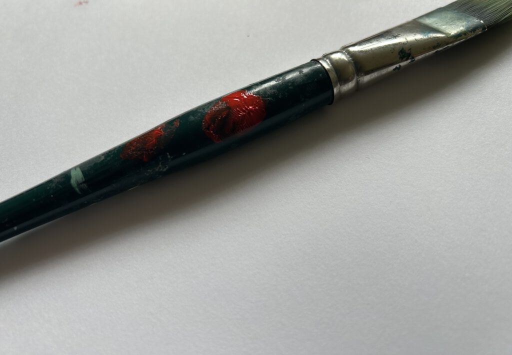
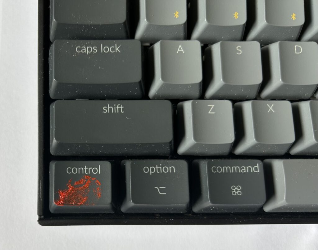
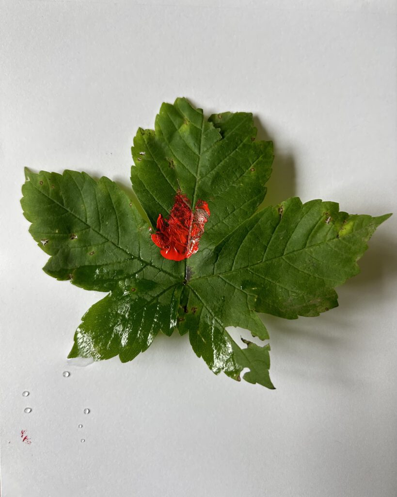
After the tutorial, I had the idea to show my hands instead of my feet. I had the feeling that they reflected me more. I was never very athletic, and instead of my feet I used my hands. Thinking about my hands made me think about fingerprints and objects that I have used in my life. And showing the prints on them. I would like to use an old analog camera I have from my grandfather (Canon AE1), but I have to check if it still works first. For now I just used my iPhone and took a few pictures.

Idea 3
Next, I thought about more interactive ways how I could approach this brief. So I started doing some further research about the meaning of quadriptych. Quad is short for quadrangle, comes from Latin and means four1 while ptych origins from Greek and means fold.2
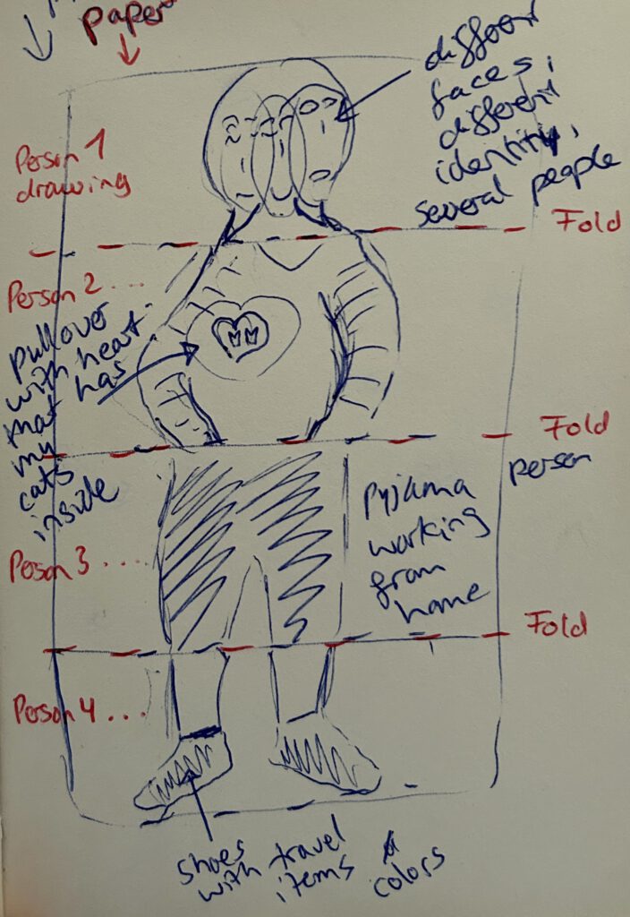
Then I had the idea to show myself like in the game I played with my grandfather over and over as a child. It’s a version of the Consequences game.3 Everyone folds their paper into four pieces and starts drawing on the first piece without showing it to the others. Then, the next person draws the next panel without checking the first, and so on. I thought like this i can show parts of my personality, my past, my current working location, etc.
Research – Industry today
It was mentioned in the podcast with Maziar Raein and Susanna Edwards, “History is fundamental to our understanding of our practice [as graphic designers]”.
Before the Second World War, the term graphic design did not exist, and it was only after the industrial revolution that advertising started to become more profitable. In the 20th century, the production process gradually became part of the design process, and towards the end of the century the boundaries became increasingly blurred as many art schools turned away from craft media and towards new technologies. At the same time, a modern movement emerged, including artists such as Kandinsky and new styles such as the Bauhaus school. Political activism was essential, and the combination of ideas about society and a new approach to design.4
In the 1960s, a time that was still heavily dominated by men, women like Bea Feitler and Corita Kent campaigned for social change in their own way. Bea Feitler used magazines as a mass medium for social change, for example by showing the first black woman in one of her magazines.
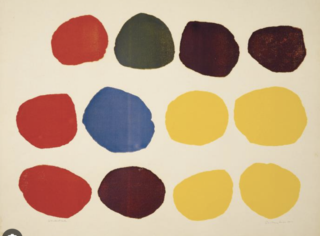
Corita Kent, on the other hand, a nun and art teacher, combined the visual language of the consumer with popular culture (‘pop art’) to address a wider audience. Like giving dots a bigger religious meaning as part of the wonderbread packaging.5
Corita Kent also wanted to draw attention to social and society-related problems. Community was a big part of her work, with her hosting several cultural gatherings. Although she became one of LA’s most important cultural figures and artists, she was not interested in attracting attention as a person and was never a celebrated artist like Andy Warhol.6
Currently, many graphic designers have to have a lot of (digital) knowledge, and even coding is not a foreign word for some. In their podcast, Susanna Edwards and Maziar Raein conclude that the public discourse we currently have sometimes prioritises political, corporate and consumer-oriented issues. For them, it is also important to focus on local practices that would otherwise be ignored.
Research task: Explore the main outlets for design in your area
I started this task by checking on Google Maps for Design studios, but due to my rural location, I decided to focus on Design Studios in the next bigger city Munich. I found one studio that has a range of projects, including designing visual identities for social or communal organizations. I wrote them asking them if they could answer a few of my questions and they agreed to a short call (to be continued next week). I also figured that there are several NPOs that offer events to connect with other people, such as an open group for making pottery.
Webinar and other thoughts
The webinar this week was another chance to get to know each other better, as we had to bring a personal item or memory that represents us. Next week we will have our first extended Webinar sharing our current ideas and progress for the first brief. Currently, it’s all about research and finding out who I am and who I want to be as a designer. I feel like learning about software skills is coming a bit short at the moment, but I hope I will find some time.
- https://www.etymonline.com/word/quad ↩︎
- https://www.merriam-webster.com/dictionary/ptych- ↩︎
- https://ourtime.org.uk/resource/consequences-a-hilarious-game-for-everyone/ ↩︎
- Lucienne Roberts: Drip-dry shirts – the evolution of the graphic designer, p.14-15, p.18-21 ↩︎
- https://blogs.getty.edu/iris/an-artist-who-sees-holiness-in-wonder-bread/ ↩︎
- https://blogs.getty.edu/iris/an-artist-who-sees-holiness-in-wonder-bread/ ↩︎
No Comment