Week 1
History Revealed (lecture by Stuart Tolley)
-> Contemporary, historical significance typography has had on location and society
Aspects of type:
- Design system
- way things relate to one another
- color
- form
- info
- texture
- tension
- tool
- identity
“Evoke the response you want while pushing the audience to see something in a new way” (Paula Scheer)
Type design history
– Western world: invention movable type & printing press (J. Gutenberg) -> start of industrialized typography, mass produce, low cost -> foundation for religious, intellectual, political changes
(Pierre Simon Fournier-> chronicled practices of book publishing)
– Industrial revolution (mid 19th cent.) -> changed social landscape in western world -> movement from country to city -> posters, signs…
– Stencling = technique for reproducing designs by pressing ink/paint over holes -> creates break effect in letters -> e.g. Venice -> VENICE NIZIOLETO font -> Venice as beautiful but not very practical place (you can get lost although there are signs in Venice Nizioleto)
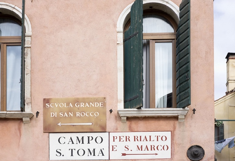
– Cities growth by 19th cent. -> artisan writers -> wanted to inform (<-> today: advertising to persuade)
- New form of transport -> new forms of typography, communication and signage
Need for unifying street signage & typography that could reflect identity of location
- Unifying visual direction/brand around typography created for first time -> Metropolitan railway London (1863); Paris (1899): Metropolitan by C. Garnier -> recognizable typographic design & identity of Paris
- London (1916): new revolutionary typeface (sans serif) for London metro -> Johnston Sans -> later became Monotype (Johnston100) = lighter, symbols added, suitable for digital => wanted to bring back the original soul (“joy of taking the metro”), e.g. added back the diamond shaped eye of the letter
- New York: Redesign signage and map: previously confusing, many types => Signage system Manual designed by M. Vignelli (Unimark): New York City Transit Authority Graphics Standards Manual
- Graphic design simplicity to aid readability and usability
Most successful typogr. street signage & transportation are omnipresent but go unnoticed
-20th cent.: street advertising
Own thoughts:
– Fascinating history of signs that we take for granted
– The story, process and iterations (and hard work) behind the signage
– Several designers over type adjusting the type to the time -> it’s purpose, people
– Simplicity is the key (beautiful)
Resources
Blackwell, Lewis (2000): ‘Edward Fella: Letters on America‘:
“America unlike Europe […] does not have urban space that is made […] of building forms over many centuries […] the built environment has arrived with the industrial […] within the time of mass-print and mass-communication […] Thus signage is a part of the environment”.
-> Uniqueness of a letterform depicted on photo; different surfaces (e.g. wood); diff. techniques (machine type, stencil..); placement in a particular environment; particular time
“Pinpoint previously unappreciated (and therefore valueless) difference and raise it to the level of significance”, transgression
– Appreciate the signs not because of historical (..) reasons but for the thing he can use
– Vernacular = dialact, national language
->no values are prescribed => process of making is important => keeps changing
Baines, Phil (2003): Signs, Lettering and Environment:
– Signs for roads -> informatory, regulatory, political act
– Utility vs. personality/style:
- train signage historically made by hand; later with industrial revolution more uniformity but still on small scale (use cast iron) -> variety of 18/19th cent lettering types
- today: functional needs of signing and possibility of reflecting identity (of organization); public typefaces often produced in unsympathetic materials (less craft skill)
- Example of healthy tradition of public art in Barcelona (Josep Maria Subirachs, Joan Brossa) -> freedom of form and positive contribution to surrounding architecture
- Possibilities: In past greater variety of letterforms and materials but we should not become nostalgic (nostalgia: heritage lobbyists try to imitate) -> rather get inspired and reminded of variety of possibilities
Letterform can’t be isolated -> situation, scale, material -> can’t be simply transfered to another field
Bentley, Alexander and O’Brian, Michael J. (2017): ‘Chapter 2: Change is not Norman’ in The Acceleration of Cultural Change:
Traditions that continue until today:
- food and diet most resilient
- languages
- wealth inheritance/ conflicts
- cultural transmissions: spreading of ideas, concepts (…) between generations as powerful an evolutionary process as genetic transmission (but over time variation is created)
Hustwit, Gary (2015): ‘A Rare Interview with Graphic Design Legend Massimo Vignelli
- Signage number one rule: give information at point of decision (e.g. driving car not give to early)
- Consistency (standardised, relationship, fewer number of typefaces, sizes)
- Computers are great but just a tool, allows to do the best but also the worst typography
- People’s awareness of type is minimal but the desire for certain type is there
- Type shouldn’t be expressive (e.g. word: dog does not need to bark)
Typography…is really white not even black. It’s the space between the black that makes it
Gary hustwit – Redesign New York transportation map (hustwit.com/the-map)
– Vignellis map is beautiful but was lacking geographics therefore only used a few years. After a geometrical map was used for many years => not as beautiful as Vignellis diagram
– Task for Hustwit’s team: Make a digital live-map that reacts to what’s happening at the moment
Problems/Learnings:
- Which streets to show?
- Additional train stations?
- Adding dynamic graphical features that could slow down performance (map has to respond; can’t be chunky)
- moving trains
- combination of geometry and geography works if you zoom enough -> zooming shows more details -> technology made it possible
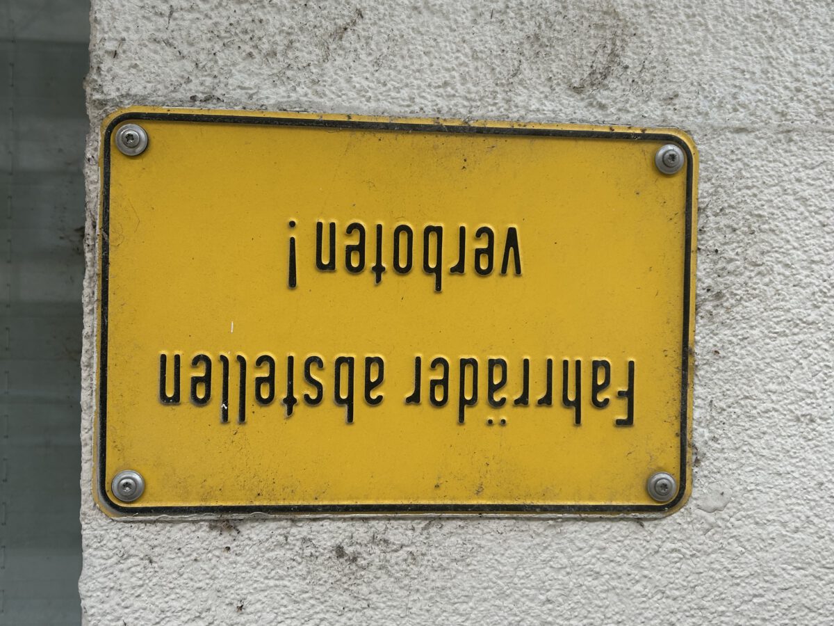
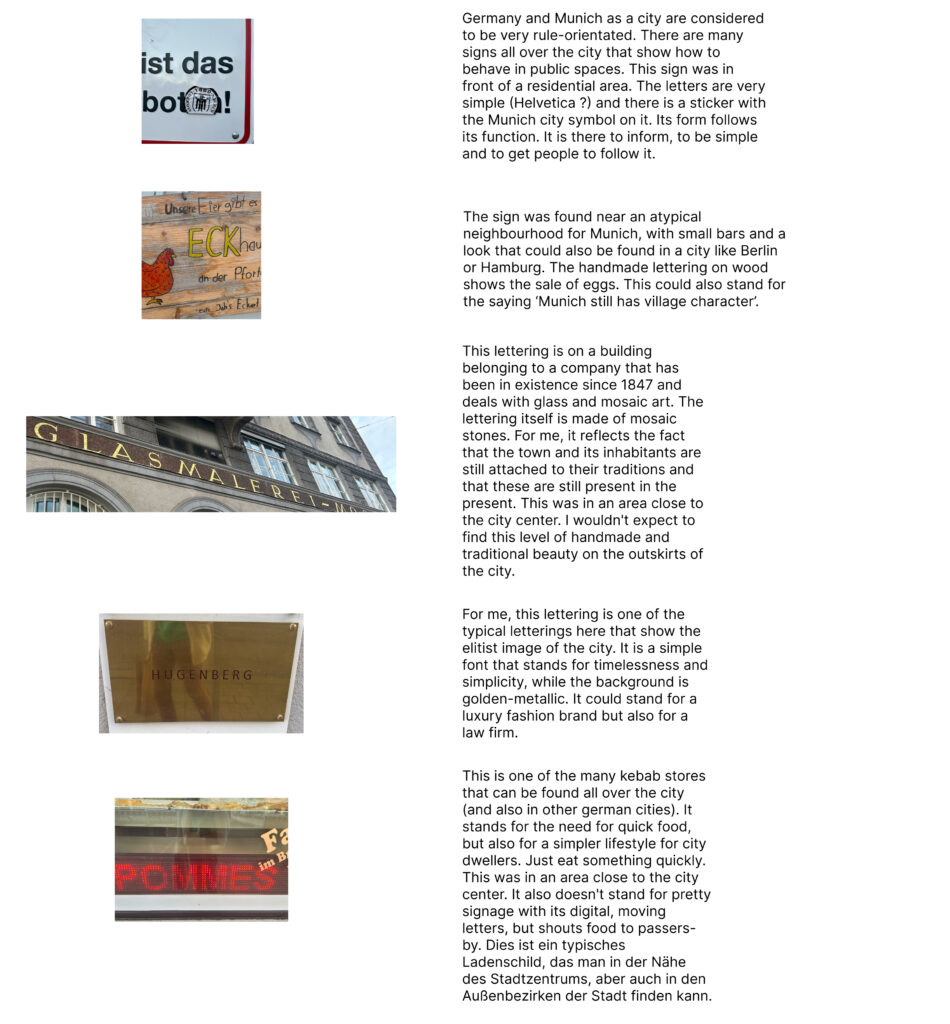
Research task: Photograph a broad selection of typography and lettering examples that illustrate what you believe define the identity of your city. Consider material make up, role, use and application, with regards to its location.
Exploring ideas about this module’s brief
The task: Create a design intervention for a cultural narrative (historical or contemporary) which has received only limited attention. This might be the story of a hidden subculture, an under-valued local site such as a community arts venue or a little-known creative practitioner.
I thought it was a good idea to work on something related to the city I live in, also because of the possible interventions and collaborations. This also requires a lot of exploration and deep immersion into the neighbourhoods. I’ve only lived in the city since last summer, and I don’t live in a very culturally rich neighbourhood, but in an area that is mainly used for residential purposes. It’s not considered particularly pretty, the main square here was in the top 10 ugliest places in the city. https://www.abendzeitung-muenchen.de/muenchen/das-sind-muenchens-haesslichste-plaetze-immer-noch-art-313409
In the first week, the research task was to document lettering that represents my neighbourhood or city. I’ve walked around my neighbourhood a few times, on the one hand it’s a place where ugly tower blocks have been and are being built as fast as possible, on the other hand it has some quiet neighbourhoods where people can live their dream of living in a small house with a garden in the city. Forstenrieder Park is also very close by, one of the most beautiful and largest recreational parks in Munich.
Nevertheless, I decided to find out a few more lettering aspects by exploring the city. My first stop was the alternative ‘Werksviertel’. I was surprised how much it reminded me of Berlin. It has some small shops, restaurants and bars that are worth exploring. I also visited an art exhibit (which is not as popular as the ones in the centre) called Kunstlabor 2. The exhibit itself is a place for cultural interim utilisation. It’s a place that temporarily is used for a specific cultural or art related purpose.
It was very interesting and full of artists’ work… I though I might be able to find an interesting initiative or creative practitioner by looking at the examples. And there were a few, like the collective ‘Broke.today’, which fills empty houses in Munich with art.
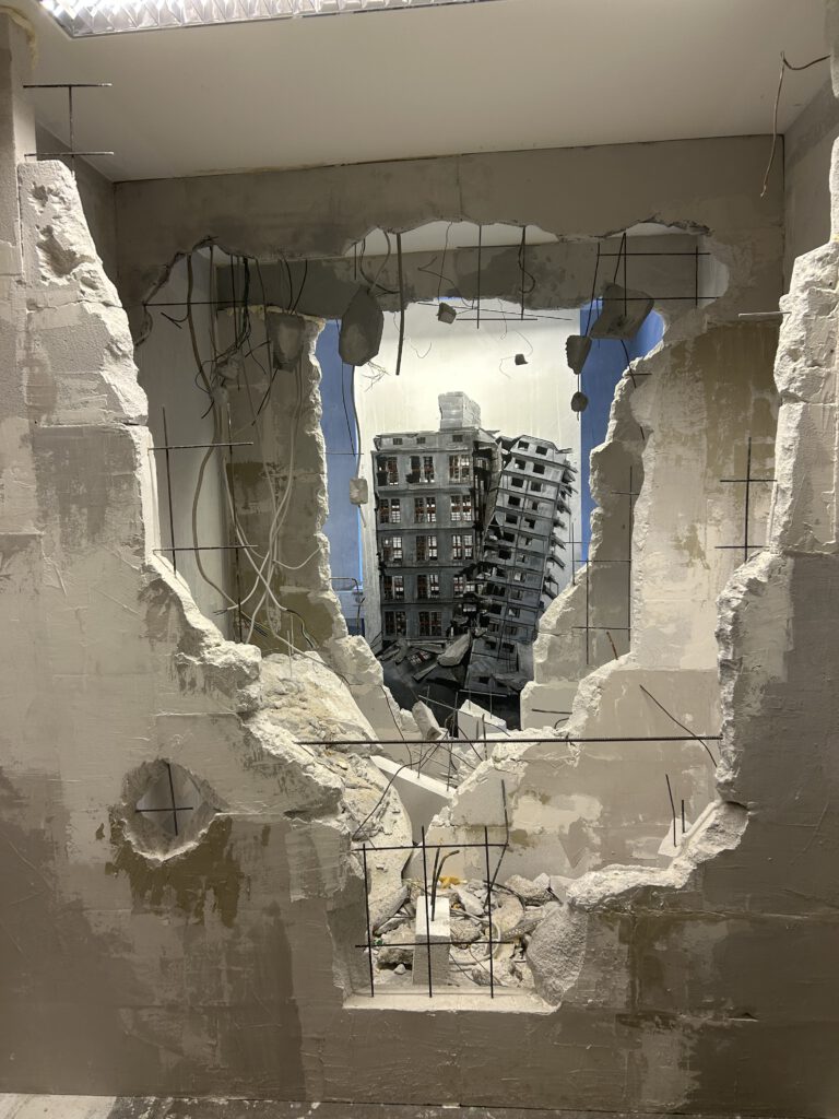
broke.today art work in Kunstlabor 2 exhibit
The city itself has a not-so-nice history as the center of the Nazi regime during the Second World War. In the 60s and 70s it was full of energy, creative influences and international atmosphere (see Amazon Prime series: When Munich was still sexy). Nowadays, the city is almost the opposite compared to cities like Berlin. It has a reputation for being very conservative and traditional and not as crazy as Berlin.
So I wonder which part of the city is not getting enough attention? The problems are obvious, e.g. housing/rent, the right prices in general. What is undervalued here? I wanted to find something that appealed to myself, e.g. a very creative/art related area or something like an intercultural theme; in the past I’ve been very fascinated by Jewish history, partly because of the atrocities that Jews (and other people) endured in WWII. I have been very interested in books on this subject. But I think this topic has been discussed a lot and it gets quite a bit of attention. The previously mentioned Schweizer Platz could be a good place to create something new, perhaps bring in more colour, but several attempts to change the face of the square have failed because, according to the city, there is no money available. Does art only have a place as a peripheral event, as the example of the temporary cultural spaces shows? Is art constantly changing?
On the other hand, I’d like to find something that’s close by, in an area that’s not as popular as the one I live in. But so far I haven’t found anything that interests me enough to get involved.

No Comment