Week 3
Lecture: Big Data by Harriet Ferguson
- Images were and still are an international language
- past: cave paintings as communication; churches: stain glass windows
- colonisation and tech led to shared signage -> e.g. stop sign
- infographic = visual representation of info (data)
- Charles Joseph Minard: ‘Analyzing Minard’s Visualization Of Napoleon’s 1812 March‘
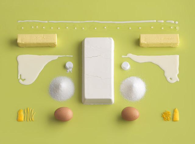
- 2010: Homemade is best by Carl Kleiner & Evelina Bratell. I find this food styling very artistic and visually pleasing.

Photo from Homemade by Carl Kleiner & Evelina Bratell: https://trendland.com/homemade-is-best-by-evelina-bratell/- infographics – info and illustrative a compliment to an article (Monocle) -> Balance form and function (podcast with Monocle)
- animations in infographics (columnfive)
- forensic architecture -> architectural evidence of humanitarian disasters
- generative design & data visualization (onformative)
- Mona Chalabi infographics -> drawing/illustrating information about certain topics such as war or wealth distribution
Ressources
- McCandless, David (2008), Information is Beautiful, Information is Beautiful Website
- Morton, Timothy (2013), ‘Chapter 1: What Are Hyperobjects? and Chapter 2: The Time of Hyperobjects’ in Hyperobjects: Philosophy and Ecology after the End of the World
- Cheng, Joanne (2014, updated 2015) ‘Analyzing Minard’s Visualization Of Napoleon’s 1812 March’
- – focus on communicating lots of info without overwhelming users with too much content
- McCandless, David (2010) The beauty of data visualization
- – It’s about patterns and connections and how data can tell a story or change a perspective
- – critic about McCandless:
- beauty over precision or depth
- aesthetics are subjective
- Interaction Design Foundation (2016) Information Visualization – A Brief Pre-20th Century History
- – until 19th century static representation of data in visual format;
- – by 16th century measurement systems became increasingly precise
- – 19th century: statistical mapping (e.g. bar charts, histograms)
- Edward Tufte: world leading expert on information visualization
- Felton, Nicholas (2015) Transforming data into meaningful stories
- – Features of big data: Volume, Velocity and Variety
- – mentions Henri Cartier-Bresson (Photojournalist): “True to form, the images were very geometric with strong leading lines and shapes” (source)
- – photography and data visualization combination in Felton’s book -> Data infused photos, create connections between different objects (angle photo taken, content, time, location) => Photoviz
- – Felton also created an personal Annual Report around his life and also a memorial to his father’s life -> shows the “power of design to allow us to read and communicate our lives [and] predict a trend that today in the world of FitBits and phone pedometers seems almost commonplace”
Webinar
- infographics: experienced readers
- Does something get attention?
“It’s not enough to uncover insights — we must also ensure that those insights can be communicated effectively and understood broadly.” (Matthew Miller)
- How to bring tactile, physical to digital space?
Research of the brief
This week I finally decided on my topic for the letter. I also talked about it with my classmates and my tutor Frauke. They all liked the idea of researching my grandmother’s story. She lived in what is now the Czech Republic near the German border in an area called at that time (?) Sudeten Germany. The Sudeten Germans had to leave their homeland after Germany lost the Second World War. My grandmother was 15 or 16 years old when she went to Germany.
I have started to talk informally with some of my relatives, as my grandmother didn’t talk much about the experience. But there are some gaps that I and others can’t fill in at this point. I know that her mother was Czech and her father was German, so he had to go to Germany, but they followed him. I’m not sure how it came about, but one version says that they didn’t have to leave so urgently because her mother was Czech, and that they decided to leave later because they wanted to be reunited with their father. Another version could be that they had to leave as many others. It also remains unclear how long their father lived in Sudeten Germany. Was he born there?
The difficult part for me is what I want to focus on in this letter.
Is it about the issue of leaving home/immigration/migration?
Or is it more something to do with my grandmother? Frauke told me I could focus on the clothes she wore, for example, and not so much on the story. But I’m not quite sure what that should look like. I thought maybe I could start from an object that belonged to her.
Unfortunately, they couldn’t bring much back from there, and the only artefact she seems to have brought back from there has my aunt. It is a brooch made of garnet stones that my grandmother turned into a necklace pendant and gave to my aunt when she was young. Another item I have is a lead glass bowl that was part of her belongings when she died, I’m pretty sure she acquired it later. But I’m not quite sure how old it is. Frauke has asked how old it is, but there is no information about the bowl.
Research question this week:
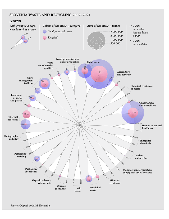
Analyse a piece of information design and consider its effectiveness at presenting complex data in way which is easy to digest. Consider clarity, communication, structure and form. Be precise and write a critical outline of this piece of work.
I think it’s worth sharing this infographic by Federica Fragapane. I like the simplicity and visual design of her infographics. She has her own style of presenting complex data. For me, the circular structure gives the infographic a certain elegance, while the shape is not typical for presenting data. The legend also makes it very clear how to read the data through colour, size of the circle and sequences.

source: https://www.behance.net/gallery/181685825/Graphics-for-theEU-Publications-Office


No Comment